ORO Website Revamp
Elevating Fine Dining Online
Role
Client
ORO
Duration
2 weeks
Team Size
Lead Designer (My Role)
Art Director (Advisory Role)
Project Manager
Designer/Collaborator
OverView
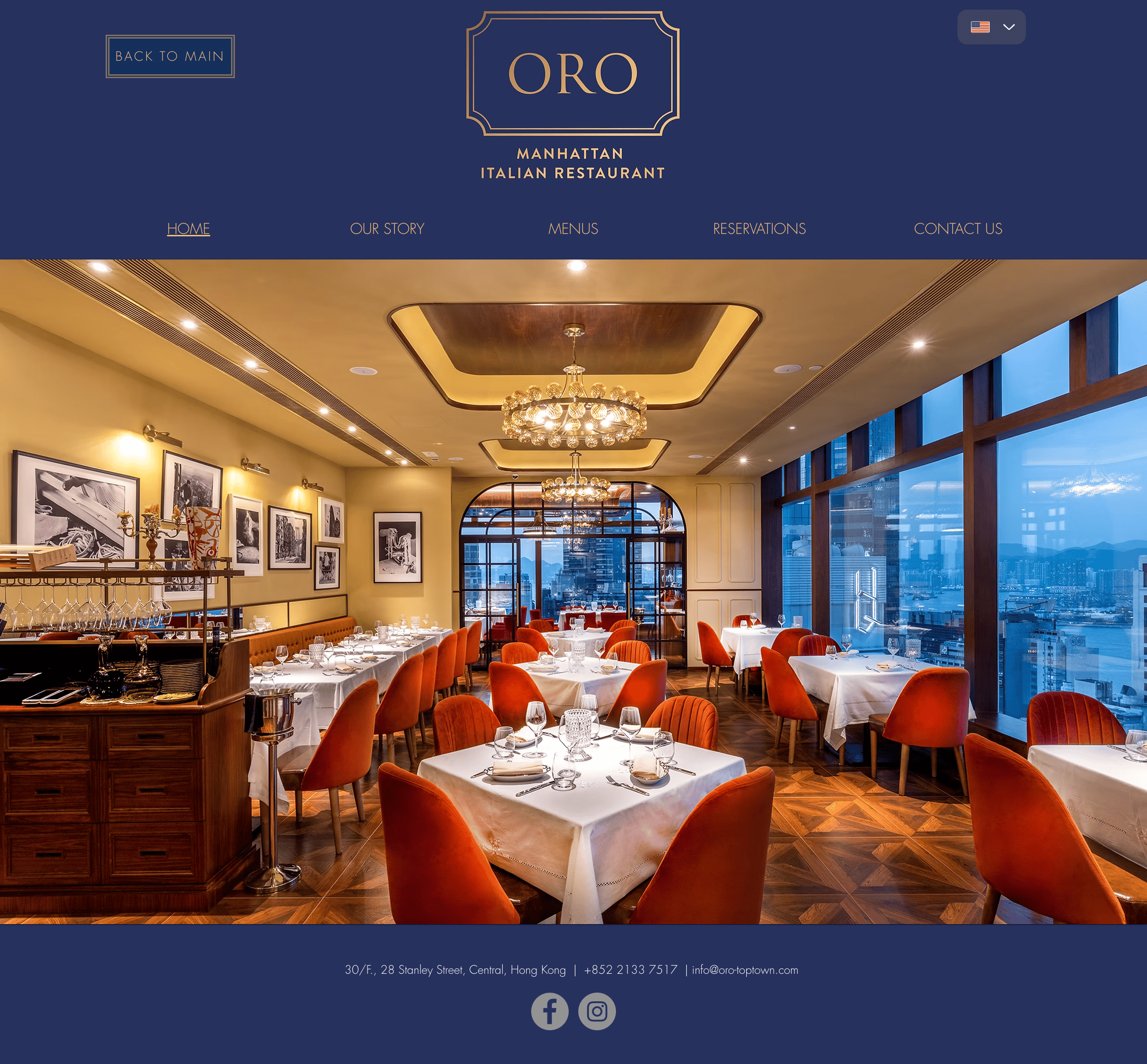
ORO, an Italian restaurant in Central, Hong Kong, sought a website revamp to modernize its visuals, improve usability, and better reflect its premium brand identity.
My role as the UI Designer focused on creating a sleek, visually engaging design while adhering to the client’s structure.
01
The problem
Design Goal


02
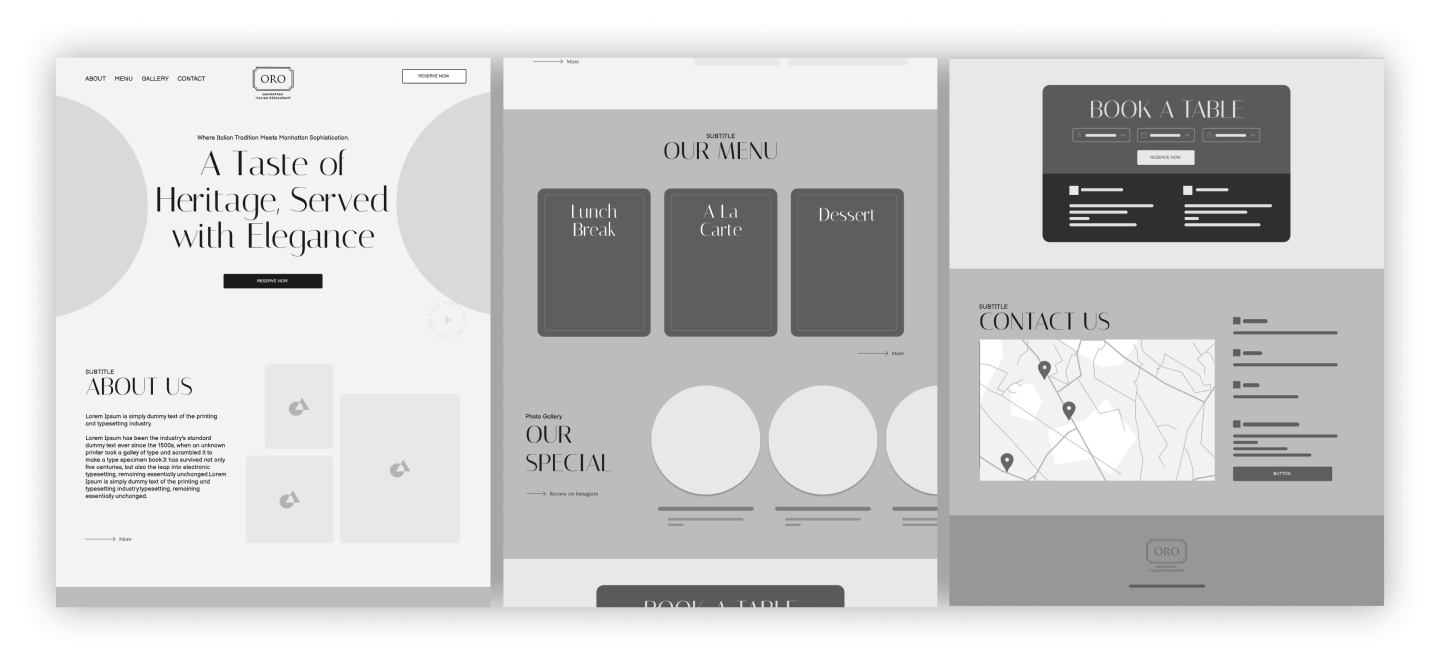
Defining the experience
Wireframes
03
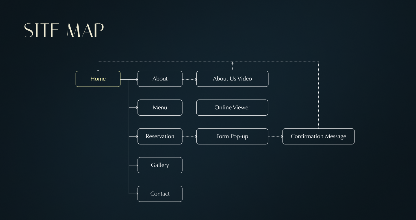
Visuals
Sitemap
Color & Font
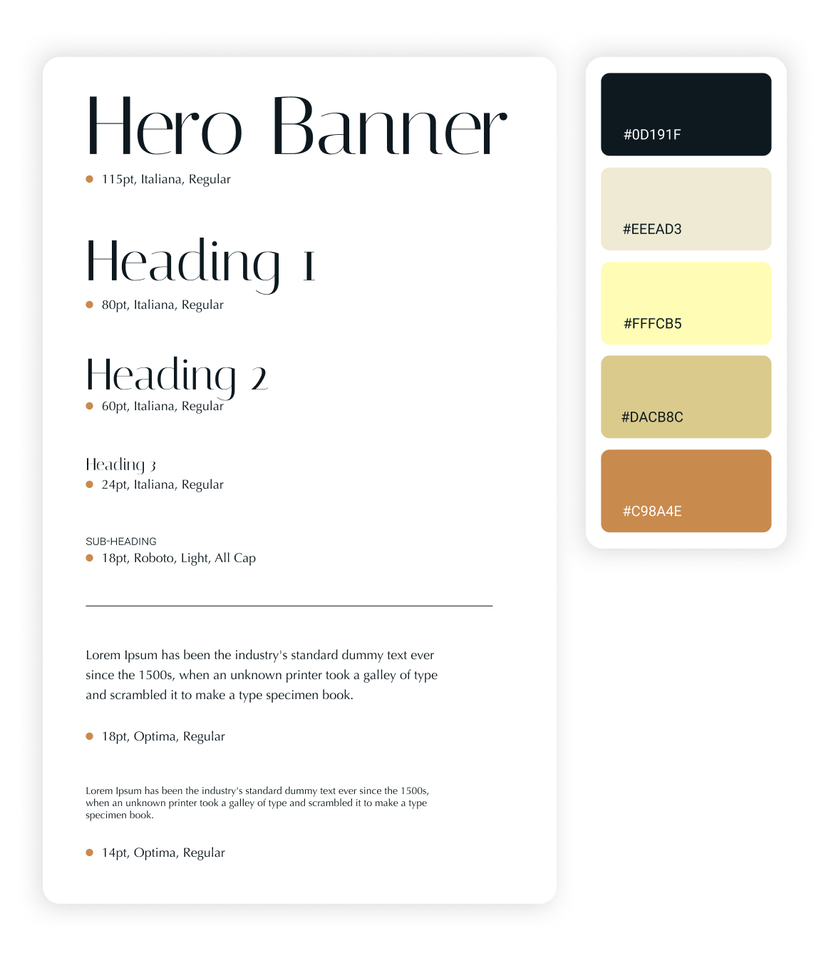
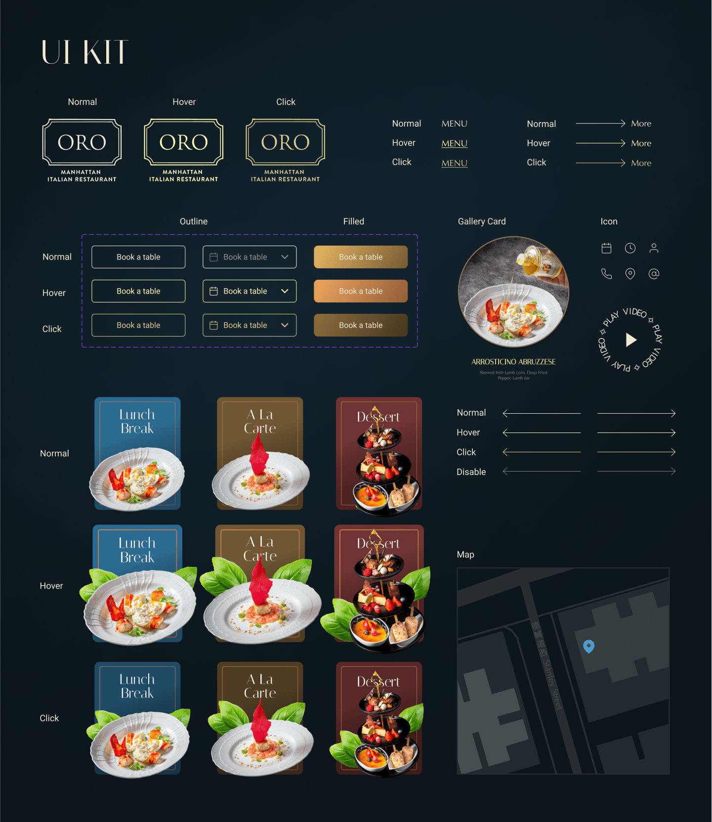
UI Kit
05
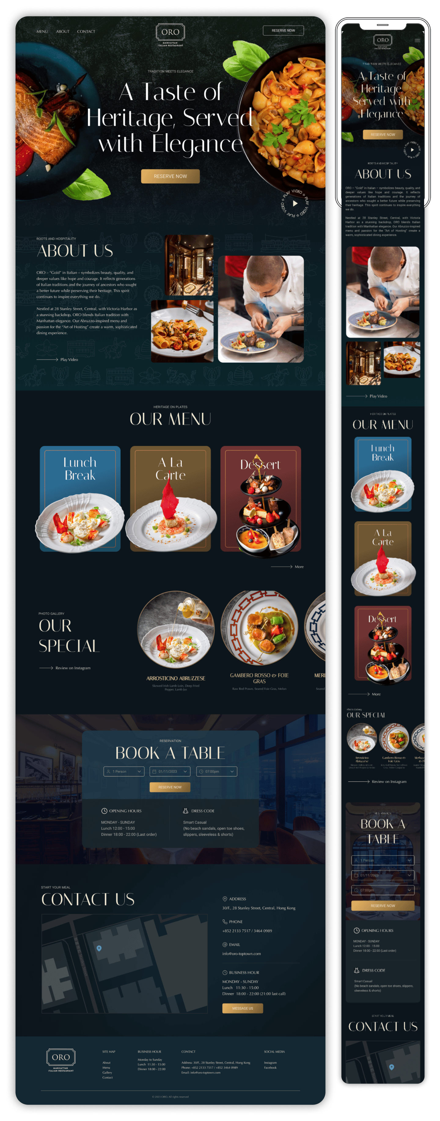
Final Design
Conclusion
The ORO website revamp successfully transformed the brand’s digital presence, aligning with its premium fine dining experience while improving usability. The redesigned site not only enhanced customer engagement but also provided a strong foundation for future digital marketing and social media strategies. This project reinforced my ability to create sophisticated, user-centered designs that reflect a brand’s core identity.